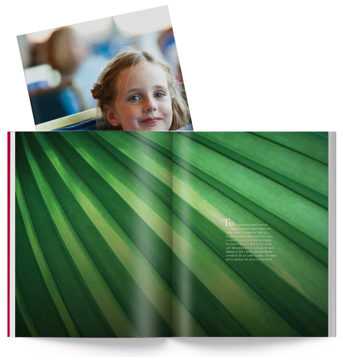
Korowa Anglican Girls' School / REPOSITION
Korowa Anglican Girls' School / REPOSITION
Brand Development
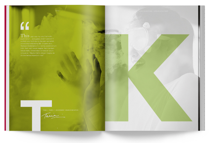
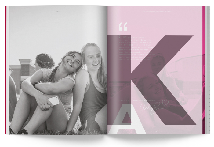
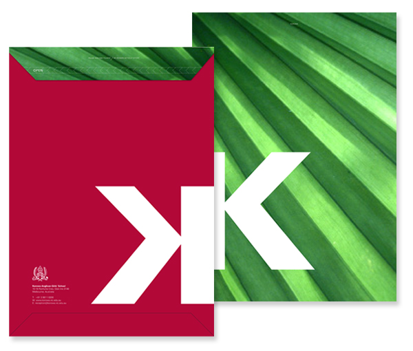
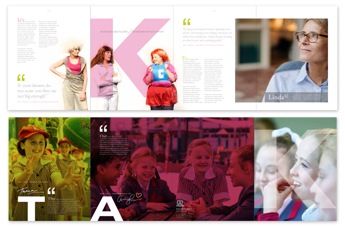
JWB&CO has taken inspiration from the attitude and language of the founding principal, Henrietta Akehurst and her daughter Ethel, pioneers and bold visonaries. Helen Carmody, the current principal, who is following in this long tradition inspired us to develop this simple idea using a bold letter form which ties perfectly into the overarching message of excellence. The "K" would live with the Korowa branding as a unique identifyer. The prospectus and all new collateral would be branded with the letter 'K' throughout. This is a signifcant historical letter because the original spelling changed from Corowa to Korowa in 1900. Changing the "C" to a "K". We wanted to continue on with this idea using the letter K as a distinctive identity device throughout the rebrand giving new marketing messaging intrique, mystique, but like the foundresses, boldness. The end goals was over time have the letter K be synomous with excellence and therefore Korowa.
The prospectus and website move through student stories of achieving excellence in whichever field it may be. Highlighting individuals in their area of success and answering how K = excellence.
- Brand repositioning
- Prospectus development
- Social / SEO Audit
- Facebook story development, management and execution + still and video
- Cinemagraph creation
- SEO
- SEM
- Mailing Envelope
- Ad
- Billboard
- Mini Propspectus
|
|
 |
 |
 |
 |
 |
 |
 |