ST MARY'S COLLEGE NEW CO-ED BRAND TO MARKET
ST MARY'S COLLEGE NEW CO-ED BRAND TO MARKET
Together = Better.
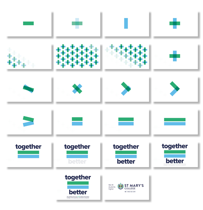
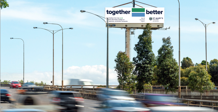
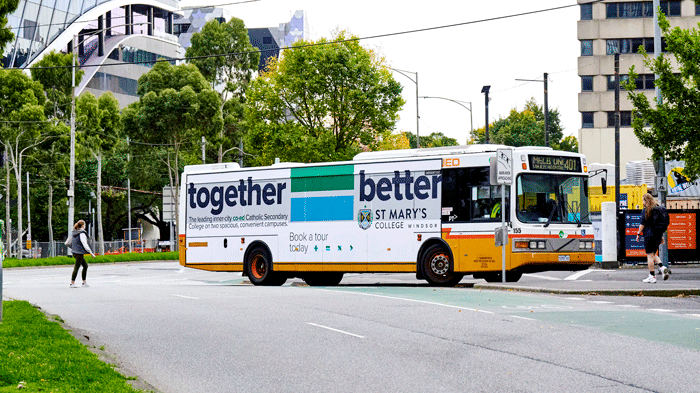
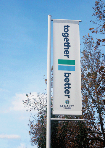
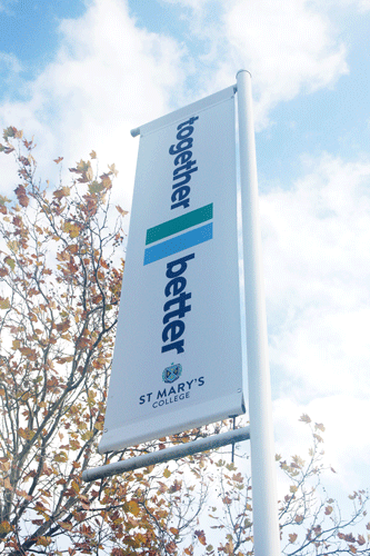
The idea comes from the two fold idea housed in the positioning statement, 'we lift students higher', that ‘we’ or ‘us’ or ‘together’ or ‘a community’ are being transformed from something smaller to something greater and better... ‘we’ as a collective lift students higher. With this idea in mind we wanted to stay away from the normal school visual vernacular... photos of boys and girls and introduce bold messages coupled with a visual lexicon of symbols which mean both us, together and bigger, greater and higher. This idea used overtime will not only differentiate St Mary’s College, but will become a parallel ad brand visual. That is, St Mary's College will be instantaneously recognised and known by these symbols. The symbols are simple and known. They can be mixed and matched to be used for a whole host of other usages.
The use of bold type, paired with strong, geometric shape on plenty of white space brings private school branding into the current age and speaks of a commitment to progression while the messaging enforces ideas of community and growth.
- Strategic Brand repositioning plan
- Strategic Marketing plan
- Communications plan
- Focus groups
- Ad campaign concept development, creative and execution
- Google Digital PPC
- Socials Digital
- Domain Digital & Print
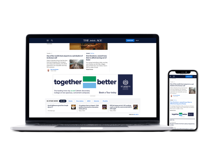
- The Age Digital
- Direct mail
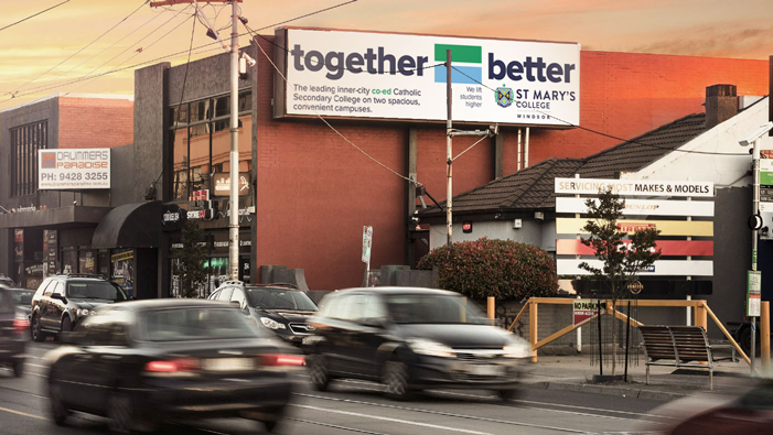
- Outdoor Billboards
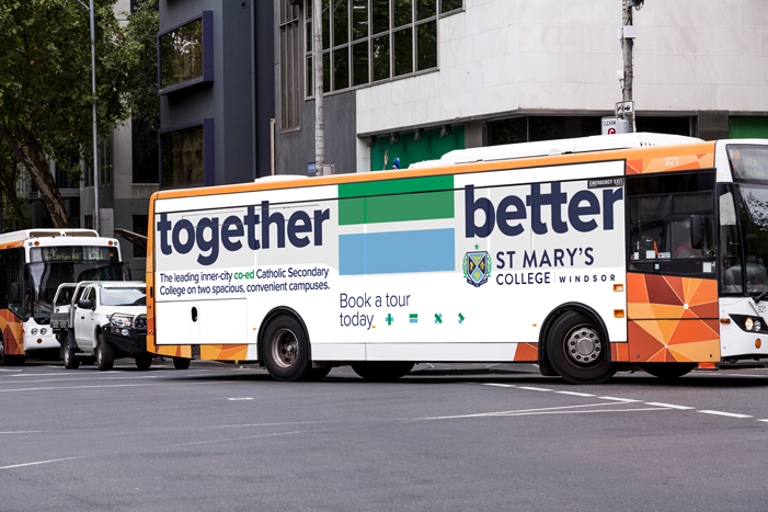
- Outdoor Bus Mega sides
  |
  |
  |
  |
  |
 |
 |
 |