Quickway / REBRAND + REPOSITION
Thank you!! Sal and I are both very happy – actually in awe – with how this is all looking. These look great. Love, Love, Love them.
Quickway / REBRAND + REPOSITION
Brand Development:
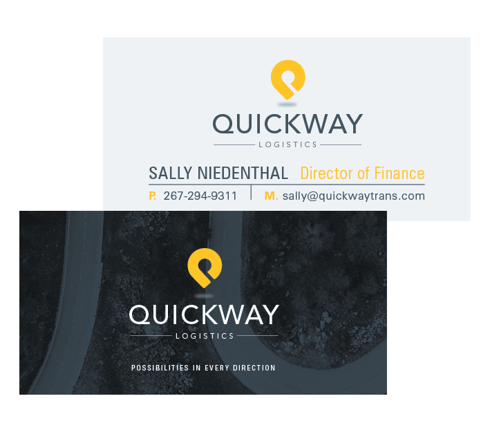
The design of the logo has been based around transport, with inspiration drawn from intersections, roads and road symbols. The aim of the designs were to somehow visually communicate movement with a simple mark. The icon itself resembles three things, a round about, the letter Q and a location symbol.
The colour palette was developed from swatches taken off a roadside image, with tones of grey, yellow used to support/link back to the idea of transport/movement.
- Logo
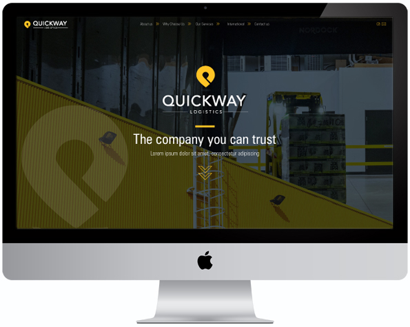
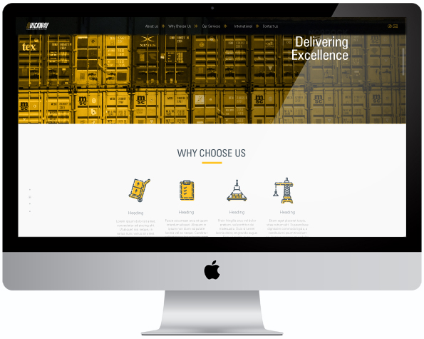
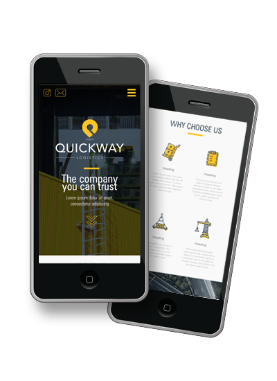
- Website
- Business Cards
- Letterhead
- Envelopes
|
|
O


